Feeds:
Posts
Comments

Archive for the ‘Ergonomics’ Category

Last week we had our UX Conference at Goldsmiths, which is the annual event where our outgoing MSc cohort get to present the results of their final projects. It was wonderful to see so many excellent presentations but sad to say goodbye to such a talented group of students (although for the handful who will be staying on as teaching assistants it may be more a case or ‘au revoir’ 🙂

I’m sure you will all go on to achieve great things. Do keep in touch!

Read Full Post »

Last week we had our UX Conference at Goldsmiths, which is the annual forum where our outgoing MSc cohort get to present the results of their final projects. It was wonderful to see so many excellent presentations but sad to have to say goodbye to such a talented group of people (although for the handful who will be staying with us as TAs it may be more a case or ‘au revoir’).

Sorry I didn’t take more photos, and that the cohort was too large for a selfie… I’m sure you will go on to achieve great things. Do keep in touch!

Read Full Post »

tabletappsI’m about to start a research project with some academic colleagues from the HCI community in the area of touch-based applications. What we want to create isn’t a game as such, but it contains game-like elements in that it needs to support:

  • the creation and deletion of ’tiles’ that can be dragged and dropped over a canvas
  • grouping, stacking and labelling of tiles
  • the ability to pan, zoom and manipulate the canvas

We are not aiming to create a product here – that will come much, much later (if at all). Instead, what we want to do is find/create a platform that allows a distributed team of researchers (who are technical but *not* developers by training) to rapidly experiment with interaction design ideas with the minimum fuss, ceremony & learning curve. So our immediate questions are:

  • Can we achieve this as a browser-based web app? (in a previous life I’ve developed Java applets, but that was many years ago & have no idea whether that is still a good solution)
  • Is it better to develop a native app? If so, which platform best fits the criteria above (iOS? Android? Surface?)
  • Is there any other possibility we’ve missed?

Read Full Post »

One of the great things about membership of the IEHF (Institute of Ergonomics and Human Factors) is the support it provides for professionalism in the workplace, backed up by a strong sense of tradition underpinning the academic roots of the discipline. But perhaps one of its weaker points is our communal readiness to embrace new ways of working and communicating, particularly regarding social media and other online networking tools (e.g. blogs, wikis, Twitter, LinkedIn, etc). There seems to be a perception (among the wider UX community, at least) that the IEHF is somewhat backward looking in this respect, with one ex-member describing it as “another association that’s extremely old school and slooooooooooow”. Reading some of these comments, you’d think that the average IEHF member couldn’t tell their RSS from their elbow. But is this really true? Is the footprint of the IEHF across social media really that shallow, or do we in fact have a small army of nascent bloggers and tweeters? I raised the issue recently on the LinkedIn IEHF forum, and this brief article summarises the response.

(more…)

Read Full Post »

A few days ago I posted an article called “Ergonomics, Human Factors, User Experience: changing terms for changing times”, which examined how the usage of these terms has changed across several decades of publications in Google Books. At the time of writing, my concern was focused on a specific issue (namely the decision of the Ergonomics Society to rename itself the Institute of Ergonomics and Human Factors) and with that in mind, along with the interests of brevity, I limited the analysis to just those three terms.

However, it has been pointed out since (quite rightly) that there are many other terms we could consider. For the sake of completeness then, what follows is a brief examination of some of the alternatives.

Of course, deciding which terms to include is in itself a subjective exercise – whichever set I choose, they will to a degree reflect my own world view and understanding of the field. But we have to start somewhere, and the following are perhaps some of the more obvious candidates:

  • Usability
  • Human Computer Interaction
  • User centred design
  • Human centred design
  • Information architecture

Note that these terms are somewhat more problematic than the original three, due to their lexical variability and the lack of an obvious canonical form. For example, should we consider:

  1. human computer interaction (in full) vs. HCI (abbreviated)
  2. user centred design (British English) vs.  user centered design (American English)
  3. user-centred design (hyphenated) vs. user centred design (non-hyphenated)
  4. User Centred Design (title case) vs. user centred design (lower case)

And so on. All these issues conspire to make the patterns more prone to noise and the results less reliable. But with that caveat in mind, let’s look at each in turn, using the original three as our datum. First, let’s look at usability and HCI. Note that I have chosen to use HCI rather than human computer interaction, as it sidesteps the hyphenisation issue (and, arguably, the capitalisation issue):

We can see that HCI follows a pattern similar to that of Human Factors, with continuous growth until the early 1990’s followed by a gradual decline over the last two decades or so. By contrast, usability displays a sharp rise from around 1990, becoming the dominant term from the mid 1990s onwards. However, the decline in usage over the last half decade or so is also interesting (the peak of 2003 becomes even more apparent if you turn off the smoothing). This is somewhat puzzling… my own subjective perception, for what it’s worth, is that the term usability has developed slightly dated, “ease of use” connotations, which I personally don’t identify with quite as much as I used to. I wonder if the pattern over the last half decade reflects a wider appreciation of this point of view.

Now let’s turn to user centred design and human centred design. I personally don’t tend to use the latter term in everyday language, but recognise the fact that it is preferred by the relevant ISO standards and – surprisingly to me – is also the more common of the two in the Google index. However, this analysis is the most problematic of them all, as it is subject to all the noise issues described above. So again sidestepping the at least one of the issues, we see the following for UCD and HCD:

But I am very sceptical of the value of this analysis. Without some way of conflating the various lexical forms and ignoring capitalisation & so on, we are not going to see a meaningful picture. Moreover, a cursory analysis of the results returned for these terms on Google Books shows several different meanings or senses for UCD, and many more for HCD. To make this analysis meaningful we need some way to perform accurate word sense disambiguation and/or cluster the results accordingly.

I am also somewhat sceptical about the value of including information architecture in this analysis. For sure, it is a term currently used within the digital community to describe the application of the principles of user centred design to the development of information-rich websites and applications. But the term was in use long before the web was invented (notably by the software industry), and I think the pattern we see in the following chart could well reflect its provenance in other disciplines:

Now let’s try a different analysis. If Google Books represents the “supply” side, i.e. content creation, what is the corresponding picture from the “demand” side, i.e. the content consumption? For this we can use Google Trends, which allows us to see how often certain topics have been searched for on Google over time (and also how frequently these topics have appeared in Google News stories). Applying the same query to Google Trends produces the following result, with the y-axis showing the average worldwide traffic for all five terms normalised by the dominant term (usability), and the x-axis showing the time period for which data is available. Note that Google Trends flattens its queries to lower case, thus eliminating one of the noise sources mentioned above. But it clearly cannot differentiate between the different senses for each of the acronyms, and for that reason in this analysis I chose to express the queries in their full British English form:

Clearly, usability remains the dominant term throughout, followed by information architecture and human computer interaction. I don’t think we can conclude much more than that without being able to magnify the scale and properly address the noise issues outlined above.

However, there are two other interesting patterns in these results. First, notice that all queries appear to be declining monotonically throughout the time period. Why is this? I think the answer may lie in the interpretation of the y axis: note that this value is actually the proportion of queries, not their absolute value. So this may reflect a gradual sophistication of user search behaviour on the web, in that queries are becoming ever more diverse as new terms are introduced and average query length increases. This is no doubt facilitated by novel UI features such as Google Instant, which faciliate the expression of longer queries. In other words, although usage of each of the queries above may be growing in absolute terms, they are nonetheless decreasing as proportion of overall web traffic. Unless Google Trends discloses absolute values for search terms, we can never know for sure.

But the more interesting pattern is the spikes in the distribution of the term usability that seem to appear midway through the final quarter of each year. What is causing these? My own hypothesis was that this could be related to World Usability Day, which since 2005 has occurred annually on the second Thursday in November. Indeed, a closer examination of the trends for each individual year does indicate a strong correlation, which appears to be borne out by the topics covered in the news stories associated with each spike. If so, it is reassuring to know that initiatives such as this do indeed appear to be having a global effect(!)

As a final datum, we should of course consider how frequently the various terms appear in the Google index itself (i.e. across the Internet). Would the patterns from Google Books be reflected across the web in general? Querying Google with each term in turn returns the following results (in descending order):

  • “usability”                                   About 21,100,000 results
  • “human computer interaction”      About 2,180,000 results
  • “information architecture”             About 1,850,000 results
  • “user centred design”                      About 131,000 results
  • “human centred design”                    About 61,800 results

So what can we conclude from the above? My own feeling is that it was a worthwhile exercise considering these additional terms, for the sake of completeness if nothing else. And the observations about sophistication of user search behaviour and the spikes due to promotional events such as World Usability Day are also interesting. In addition, this analysis has revealed two other, unanticipated insights, in the form of suggested extensions to the Ngram Viewer:

  • The ability to control case sensitivity and conflate common lexical variations, e.g. due to hyphenation and so on
  • The ability to cluster results around the different senses for each term

Of course, word sense disambiguation is an issue that has challenged some of the best minds in NLP for several decades, so I’m not expecting overnight results here. But robust methods for document clustering are eminently available, and I can think of all manner of ways such techniques could be applied to improve the Ngram Viewer experience and in so doing provide some intriguing visualisation possibilities.

I also have some initial thoughts about how to develop further insight into the context in which terms are used, which may allow us to dig a little deeper below the surface. I hope to post something about this in the next few days. In the meantime, if you have any suggestions or extensions you’d like to see, by all means let me know either here or by email.

Related Posts:

  1. Ergonomics, Human Factors, User Experience: changing terms for changing times
  2. The Ergonomics Society and the Digital Blind Spot
  3. User Research Plans for the Ergonomics Society Website
  4. The Dimensions of Search User Experience
  5. User Interface Design Patterns for Search & Information Discovery

Read Full Post »

Just over a year ago the Ergonomics Society changed its name to the Institute of Ergonomics and Human Factors, in recognition (among other things) of the discrepancy between the growing range of interests within the organisation and the somewhat narrower perception of the term “ergonomics” to the world outside. There are many people who feel passionately about such terminology, and will argue quite strongly that it is perceptions that we should be changing, rather than our own identity. On the other hand, there are those who think that it is quite right that organisations should evolve to reflect the changing world, and that names and labels should not be thought of as sacrosanct.

But the purpose of this post is not to enter that debate. Instead, it is to test some of the assumptions about the usage of these terms, and see if they really hold true. This task is made somewhat easier by the recent launch of the Google Books Ngram Viewer, which gives us a unique insight into the usage of terminology across a range of publications, time periods and corpora (i.e. geographically-based collections). Google Books claims to have scanned over 10% of all books ever published, providing data on the occurrence of phrases up to five words in length from 1400 through to the present day.

For example, I had assumed (wrongly, as it turns out) that the term ergonomics was more prevalent this side of the Atlantic, and conversely that human factors was the dominant term on the other. This is a crucial point, as it underpinned the notion (in my mind, at least) that by adopting the term human factors we would better articulate our identity and mission to a global audience. (Indeed, by changing the name that outcome may still hold true, but evidently not for the reasons I’d assumed.)

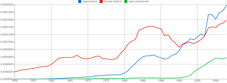
So let’s look at the data. First, let’s see how often the terms “ergonomics”, “human factors” and “user experience” appear in all the English books indexed by Google, from 1950 to date. I have included the third term partially as it reflects my own personal interests (being by far the dominant term in the development of digital interactive products, e.g. web, software, mobile, and so on), and partially as a reflection of its growing acceptance in wider UCD circles (such as official standards documentation).

As I expected, user experience took off in the late 1990’s and continues on an upward trend. But what I didn’t anticipate is that ergonomics continues on an upward trend too, whilst usage of the term human factors actually appears to be declining from about 1990 onwards. This was certainly unexpected. So let’s check whether a geographic effect is at play: is this true of books published on both sides of the Atlantic? If we look at just those published in GB, then we see that user experience continues to rise, as expected, but both ergonomics and human factors start to fall from around 2000 onwards (with ergonomics entering a particularly steep decline):

Conversely, if we look at just books published in the US, then all 3 show a strong upward trend, and contrary to my own expectations, ergonomics is actually the dominant term over the last decade and a half:

The contrast between the US & GB trends is puzzling – why are ergonomics and human factors in such steep decline in GB when they are rising in the US? There must be further factors at play. Unfortunately, Google Books does not allow us to formulate queries such as “show me occurrences of these terms in all corpora except this one” (i.e. to see what the global trend is outside of either US or GB). Note also that the y-axis shows only percentages, so it is not possible to establish a baseline by which we can compare the absolute figures for different corpora.

So let’s try a different analysis. If Google Books represents the “supply” side, i.e. content creation, what is the corresponding picture from the “demand” side, i.e. the content consumption? For this we can use Google Trends, which allows us to see how often certain topics have been searched for on Google over time (and also how frequently these topics have appeared in Google News stories). Applying the same query to Google Trends produces the following result, with the y-axis showing the average worldwide traffic for all three terms normalised by the dominant term (ergonomics), and the x-axis showing the time period for which data is available:

Evidently, ergonomics is still the dominant term, but both this and human factors are in decline throughout the time period (note also the seasonal spikes at the end of each calendar year). User experience appears stable and dominates the Google News content, but it is hard to conclude more without being able to magnify the scale or probe further.

As a final datum, we should of course consider how frequently the various terms appear in the Google index itself (i.e. across the Internet). Would the patterns from Google Books be reflected across the web in general? Querying Google with each term in turn returns the following results:

  • Ergonomics                         6,110,000 results
  • “Human factors”              2,350,000 results
  • “User experience”          14,900,000 results

So, what can we conclude from all this? My personal feeling is that these investigations present many more questions than answers at this stage, so any conclusions we can draw thus far should be tentative at best. That said, the data would appear to suggest the following:

  1. The assumption that human factors is the dominant term in the US no longer appears to be true (at least, not for the last decade and a half)
  2. Usage of human factors appears to be declining globally, while both ergonomics and user experience continue to rise
  3. Both ergonomics and human factors have risen in the US over the last decade, but fallen in GB
  4. From a “demand” perspective, both ergonomics and human factors appear to have steadily declined over the time period for which data is available
  5. User experience is by far the dominant term across the Internet in general

Over the next few days I’ll be thinking about further ways to explore or validate the above observations. In the meantime, if you want to suggest any extensions or observations of your own, just drop me a line either here by email.

Related Posts:

  1. The Ergonomics Society and the Digital Blind Spot
  2. User Scenarios for the Ergonomics Society Website
  3. User Research Plans for the Ergonomics Society Website
  4. The Dimensions of Search User Experience
  5. User Interface Design Patterns for Search & Information Discovery

Read Full Post »

Quick announcement for IEHF members and recent HF/ergonomics graduates: attached below is a flyer for a mobile app design competition we’re currently running. The prize is an iTunes voucher worth ÂŁ100 which will be presented at the IEHF student conference. And they say there is no such thing as a free lunch!  The full text is appended below. If you have any questions about the competition itself, you can raise them here or direct to me via email.

Great to see the IEHF grooving with the kids and getting hip with mobile 🙂

Design a mobile app and win a ÂŁ100 iTunes voucher!

Enter this great competition and you could win a £100 voucher for iTunes. That’s hours and hours of music, movies and TV shows!

All you have to do is come up with a great idea for a new mobile app that would be of value to ergonomists and human factors professionals. It can be a generic productivity tool or aimed at a specific sub-discipline, for example, HCI, healthcare, transport, etc. The idea doesn’t need to be unique, but it should take advantage of the mobile medium.

Your concept should be presented in the form of a design brief, that is, a specification containing sketches, flows, wireframes or whatever visuals are needed to communicate the design concept. Note that you don’t actually need to build the app yourself (but credit will be given for productive consideration of this issue). Questions about the competition can be addressed to Tony Russell-Rose, Chair of the IEHF’s HCI Special Interest Group (email hci_sig@yahoo.co.uk). The judges will be looking for originality, feasibility, good design and usability.

The competition is open to all delegates that attend the Institute of Ergonomics & Human Factors Student Conference 2010 who are students or recent graduates (those who have graduated since 1st January 2008).

The conference will take place on Wednesday 17th November 2010 at the Heritage Motor Centre, Gaydon, Warwickshire and aims to tell you all about the careers available to you in ergonomics and human factors. You will also get an exclusive tour around the Motor Centre. To find out more about the conference and to book (if you haven’t already), visit www.sc2010.org.uk. It’s just £35 for IEHF members, £45 for non-members.

The competition winner will be announced and the prize awarded at the Student Conference. You need to get your ideas down on paper and email them to Kia Horrocks at the IEHF, email kia@ergonomics.org.uk. Remember to include your name and a contact telephone number. The closing date for the competition is 5th November 2010. Good luck!

Read Full Post »

I don’t normally circulate CfPs here as a matter of course but this one is our own Create conference, sponsored by the IEHF. It’s also a great event in its own right – hope to see some of you there. Note though that the early bird rate expires on Monday 31st.

+ + + + + + + + + + + + + + + + + + + + + + + + + + + + + + + +

Create10 :: the conference for innovative interaction design

30th June – 2nd July 2010

Edinburgh Napier University, Edinburgh UK

http://www.create-conference.org/

+ + + + + + + + + + + + + + + + + + + + + + + + + + + + + + + +

Programme online now, early registration ends 31st May

The Create conference centres on interaction design, a young discipline with roots in human-computer interaction, ergonomics, product and graphic design, multi-media and art. An interaction designer is a difficult person to pigeon hole and can be found in mobile phone companies, consumer product manufacturers, design consultancies, as a single practitioner, or within academic computing and design departments.

As well as presentations of academic research, interactive demos and student work, the conference will provide real learning opportunities through case studies, discussion and demonstrations. We also present theoretical and research perspectives on the process of design innovation and approaches to creativity in HCI; how human factors can be integrated within a creative design process, methods that encourage creativity in interaction design, and the challenges of working in multi-disciplinary teams.

Conference Keynotes

Mika Tuomola is artistic director of Crucible Studio at the Media Lab of the University of Art and Design Helsinki and has produced highly innovative interactive TV productions.

Jason Bruges produces innovative installations and bridges his work  between architecture, interaction design and installation art. He has just been nominated for a Brit Insurance Design Award for his Panda  Eyes installation, originally created for the World Wildlife Fund.

Prof. Ernest Edmonds, University of Technology, Sydney is one of the  rare academics who has successfully brought together human-computer  interaction, creativity and art.

Create10 Design Exhibition

Alongside the conference and showcase, Create10 is very pleased to be presenting some of the most innovative work from current international students alongside works from awarding-winning design practitioners. A jury of design practitioners selected works from an open competition aimed at students from a wide range of creative disciplines. The selected entries will be displayed at the Create10 design exhibition from June 30th to July 9th 2010 in Edinburgh, at New Media Scotland’s Inspace.

Competition Jury

Dr Shaleph O’Neill,  Exhibition & Student Competition Chair
Mark Daniels
Anab Jain
Crispin Jones
Di Mainstone
Christopher Pearson

Digital Creativity Journal

We have also agreed with the journal Digital Creativity that successful papers and student submissions will be invited to submit their work for potential publication.

+ + + + + + + + + + + + + + + + + + + + + + + + + + + + + + + +

http://www.create-conference.org/

Read Full Post »

Better late than never… in case you missed it, March 15 was the deadline for paper submissions to Create 2010. For those unfamiliar with Create, it’s a conference series that began life as a collaboration between the IEHF and the BCS, with the first event being held in London in 2007. It has since then expanded both its scope and influence to embrace new communities (such as art & design) and new locations (such as Edinburgh).

My involvement with the event is somewhat more peripheral this year, partially due to the distances involved, but also to give some other folks the chance to shape the event and further develop its identity. This is being admirably done by Edinburgh Napier University, who are not only hosting the event but also managing most of the programme. So you may be too late now for a formal paper submission, but there are plenty of other opportunities to contruibute, including short papers, posters, demos and more.  Full details below.

Create10 :: the conference for innovative interaction design30th June – 2nd July 2010
Edinburgh Napier University, Edinburgh UK

SUBMISSIONS

The Create10 conference is seeking submissions in the form of full papers, and other submissions such as workshops, short presentations, commercial case studies, student work-in-progress, demonstrations and exhibits.

THEME : : TRANSITIONS
We invite examples of innovative design from the commercial, academic, public, government and research sectors. Cases can come from any paradigm – the web, mobile and hand held, products or consumer electronics. We would particularly like to encourage submissions from students. They will be given the opportunity to showcase and discuss both finished work and work-in-progress in a supportive environment.

The Create conference centres on the discipline of interaction design, a young disciple with roots in human-computer interaction, ergonomics, product and graphic design, multi-media and art. An interaction designer is a difficult person to pigeon hole and can be found in mobile phone companies, consumer product manufacturers, design consultancies, as a single practitioner, or within academic computing and design departments.

We are seeking original, unpublished work under the following categories:

FULL PAPERS (2 stage submission)
– High quality academic papers for peer review (max 6 pages)

OTHER SUBMISSIONS (single stage)
– Practical half-day workshops
– Short papers and/or case studies from practitioners within the field
– Short presentations and/or posters from students to be presented in informal student sessions
– Demonstrations and/or videos of installation-based exhibits or creative work in progress

Please note that all successful authors will be expected to pay to register for the event.

+ + + + + + + + + + + + + + + + + + + + + + + + + + + + + + + +

IMPORTANT DATES

Submissions of:
max 1 page abstracts for papers : 15th March 2010
max 2 page proposals for all other submissions : 31st March 2010

Notification of acceptance : Early April 2010
Full paper submission : End of April 2010

http://www.create-conference.org/calls-for-participation/

+ + + + + + + + + + + + + + + + + + + + + + + + + + + + + + + +

CONFERENCE KEYNOTES
Mika Tuomola is artistic director of Crucible Studio at the Media Lab of the University of Art and Design, Helsinki and has produced highly innovative interactive TV productions.

Jason Bruges produces innovative installations and bridges his work between architecture, interaction design and installation art. He has just been nominated for a Brit Insurance Design Award for his Panda Eyes installation, originally created for the World Wildlife Fund.

Prof. Ernest Edmonds, University of Technology, Sydney is one of the rare academics who has successfully brought together human-computer interaction, creativity and art.

+ + + + + + + + + + + + + + + + + + + + + + + + + + + + + + + +

STUDENT DESIGN COMPETITION
In addition to the above call Create10 is organising a unique competition for students.

Today’s art, design and technology students are the people who will be defining what the interdisciplinary field of interaction design will become in the near future. Create10 is a conference that celebrates innovative interaction design, whether digital products, services, environments or new interaction paradigms.This competition is aimed at students from a wide range of disciplines, for example: interaction design, product design, industrial design, communications design, architecture, fashion, multimedia, HCI, and related fields. Students, both undergraduate and postgraduate, can enter for up to a year after completing their studies.

Entries will be assessed by a jury of leading creative design practitioners and academics: Dr Shaleph O’Neill, Mark Daniels, Anab Jain, Crispin Jones, Di Mainstone, Christopher Pearson.

All selected submissions will be exhibited at the Create10 conference exhibition in June /July 2010 in Edinburgh, at New Media Scotland’s Inspace. There will be one free conference place available for each successful entry, as well as access to assistance with travel.

Read Full Post »

HCI 2009

HCI 2009

On September 4th my Endeca colleague Mark Burrell & I are presenting a tutorial at HCI 2009 called Designing Effective Search & Discovery User Experiences“. This half-day tutorial provides a  practical introduction to Human Centred Design for information search, access and discovery. We present a concise overview of the “Design for Discovery” framework and show how this can be applied to the design of search user interfaces. A key element of the tutorial is the opportunity to apply these skills  in a practical group exercise.

The cost for this tutorial is just ÂŁ40, which by most people’s standards is extremely competitive. It certainly compares very favourably with the typical price for commercial user experience training courses, e.g. this one which costs ÂŁ675 + VAT for 2 days, or this one which costs 425 + VAT for just one day (in fact, I used to teach the first of these two courses). Note that attendees not have to register for the main conference event, i.e. you can attend just the tutorials alone.

See the HCI 2009 conference website for further details. For convenience I’ve included the official blurb below.

Overview

This half-day tutorial provides a practical introduction to Human Centred Design for information search, access and discovery. We present a concise overview of the “Design for Discovery” framework and show how to apply this to the design of search user interfaces. A key element of the tutorial is the opportunity to apply these skills in a practical group exercise.

Benefits

Participants will learn:

  • the fundamental concepts and principles of Design for Discovery
  • how to differentiate between various types of search behaviour: known-item, exploratory, etc.
  • models of human information-seeking behaviour, and how to apply interaction design principles based on those models
  • an understanding of the key variables of user type, goal and mode of interaction, and how to apply these variables when designing for varying user contexts
  • the role of design patterns, and how to apply Endeca UI design patterns and those of other pattern libraries in designing search user interfaces

Audience

Web designers, information architects, user experience architects, and HCI professionals and researchers interested in the designing more effective user interfaces for search and information access. No specialist skills or knowledge are required.

Instructors

Tony Russell-Rose is User Experience Manager at Endeca Technologies, an enterprise software company specialising in innovative solutions for information search and discovery. Before joining Endeca, Tony was founder and director of UXLabs, a user experience consultancy specialising in technology innovation and applied R&D. Prior to this he was R&D group manager at Canon Research Centre Europe and technical lead at Reuters, specialising in advanced user interfaces for information access and search. He holds a PhD in HCI and a first degree in engineering, majoring in human factors. Tony is also Honorary Visiting Fellow at the Centre for Interactive Systems Research, City University London.

Mark Burrell is Worldwide Lead for User Experience at Endeca Technologies. He has over 25 years of professional experience, including 15 years focused on the evaluation, design, and adoption of interactive technology solutions (with special emphasis on applications that aim to support learning and discovery). Prior to joining Endeca, Mark built and led user experience teams at several leading product and service companies including serving as Sr. UX Manager for Microsoft’s Unified Communications product division and Global UX Lead for Sapient. Mark holds a PhD in Clinical psychology with concentrations in cognitive psychology and epistemology/philosophy of science.

Read Full Post »
Older Posts »